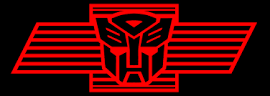
I find that the Autobot logo is secure and shows friendship because it is partly square and curved on the top. Since the bottom is also sort of pointed witch can represent that it could be evil but since the colour is light red it could represent friendship and safety. I also see that this logo shows positive space because all the white on the face is spaced and is a pattern on each side. i also think that the line detail is very complex but it still shows friendlyness and safety by the different types of shapes used in the logo.
I know that the toronto maple leafs logo is a combination of typographic and pictographic and i strongly agree with the choice of colour used by the logo because the white contrasts with the blue of the logo and it is very interesting to see the choise of line used by the artist. I also find that the texture of the leaf is very rough but it is still unique and it has more than one type of line. It has some straight lines and some zigzag lines aswell.

Finally i find that the google chrome logo is colourful and shows friendship and help because of the blue,green and yellow on the symbol. This logo i beleive shows the simplexity of a logo.

No comments:
Post a Comment