Monday, 12 November 2012
Line
This week i will be talking about the element of line. This element is called line because it can be an outline or the shape. Line consists of three different rules. These rules are contour line wich means the traceing of the outer edges of an object. Expressive line is the second rule wich expresses the quality or emotion of the person drawing the object. Finaly regulating line wich gives measure and structure to our preception ( not visible).

Wednesday, 24 October 2012
Chess Piece
 This is my chess piece scan it shows leading lines because the lines are pointing to the actual chess piece. This also shows value because every other line is shaded. I was trying to create leading lines and i was trying to create movement by making these lines point to the chess piece and up towards the top of the page. This picture demonstrates pattern because the lines are consistent and are the same distance apart.
no kissing edges

Tuesday, 23 October 2012
my awesome picture

Friday, 21 September 2012
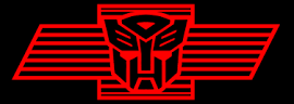
I find that the Autobot logo is secure and shows friendship because it is partly square and curved on the top. Since the bottom is also sort of pointed witch can represent that it could be evil but since the colour is light red it could represent friendship and safety. I also see that this logo shows positive space because all the white on the face is spaced and is a pattern on each side. i also think that the line detail is very complex but it still shows friendlyness and safety by the different types of shapes used in the logo.
I know that the toronto maple leafs logo is a combination of typographic and pictographic and i strongly agree with the choice of colour used by the logo because the white contrasts with the blue of the logo and it is very interesting to see the choise of line used by the artist. I also find that the texture of the leaf is very rough but it is still unique and it has more than one type of line. It has some straight lines and some zigzag lines aswell.

Finally i find that the google chrome logo is colourful and shows friendship and help because of the blue,green and yellow on the symbol. This logo i beleive shows the simplexity of a logo.

Friday, 14 September 2012
today i am going to be talking about the adobe illustrators warp tool.This tool can take any shape and you can make it into something that that you want by moving the mouse over whatever you have selected. this tool can come in handy when you just want to mess around and if you need a certain shape.http://www.youtube.com/watch?feature=player_detailpage&v=yskJess1fNQ
 I
feel that that this painting looks creative and I think a confident and
enthusiastic artist in Francois-Xavier Laval-Montmorency made it. I feel the design and shape pop to life
and look as if it was used in real life.
I believe that the Louis XIV design is unique and complex because of all
the characteristic traits on the painting of the candlesticks. I believe that the artist was trying to
tell people that churches were important. This painting is very great and it symbolizes the
churches. I think that the artist created a good balance by making the painting detailed and i find that the value is neat and organized. I think the artist did a good job at creating a scenes of texture and shape. I also believe that this is very formal and unified.
I
feel that that this painting looks creative and I think a confident and
enthusiastic artist in Francois-Xavier Laval-Montmorency made it. I feel the design and shape pop to life
and look as if it was used in real life.
I believe that the Louis XIV design is unique and complex because of all
the characteristic traits on the painting of the candlesticks. I believe that the artist was trying to
tell people that churches were important. This painting is very great and it symbolizes the
churches. I think that the artist created a good balance by making the painting detailed and i find that the value is neat and organized. I think the artist did a good job at creating a scenes of texture and shape. I also believe that this is very formal and unified.
Subscribe to:
Posts (Atom)